Create Alert Message using Laravel Component with Alpine.js
CSS - tailwindcss
In recent laravel updates, there is a new tool in the blade view engine called components. it is similar and benefits to sections, layouts, and includes; however, some may find the mental model of components are easier to understand. There are two approaches to writing components: class-based components and anonymous components. In this post, we are going to do class-based components.
STEP 1: New Laravel 8
Follow this guideline from the official laravel website https://laravel.com/docs/8.x/installation to install. In my case, I use composer to set up a new laravel project.
composer create-project laravel/laravel example-app

cd example-app

php artisan serve
STEP2: Create route, controller, and view
- Create a new route in routes\web.app
Route::get('/dashboard', 'App\Http\Controllers\DashboardController@getIndex');
- Create new DashboardController using artisan command
php artisan make:controller DashboardController
<?php

namespace App\Http\Controllers;

use Illuminate\Http\Request;
use Session;

class DashboardController extends Controller
{
    public function getIndex(Request $request){
        Session::flash('alert_message', 'It is a long established fact that a reader will be distracted by the readable content of a page when looking at its layout. The point of using Lorem Ipsum is that it has a more-or-less normal distribution of letters, as opposed to using Content here, content here, making it look like readable English.');
        return view('dashboard');
    }
}
- Create a blade view to display an alert message
<!DOCTYPE html>
<html lang="{{ str_replace('_', '-', app()->getLocale()) }}">
    <head>
        <meta charset="utf-8">
        <meta name="viewport" content="width=device-width, initial-scale=1">

        <title>Alert Component</title>

        <!-- Fonts -->
        <link href="https://fonts.googleapis.com/css2?family=Nunito:wght@400;600;700&display=swap" rel="stylesheet">

        <!-- tailwindcss -->
        <link href="https://unpkg.com/tailwindcss@^2/dist/tailwind.min.css" rel="stylesheet">

        <style>
            body {
                font-family: 'Nunito', sans-serif;
            }
        </style>
    </head>
    <body>

        @if(session('alert_message'))
            <x-alert></x-alert>
        @endif

    </body>
</html>
STEP3: Create a simple alert component
- Using artisan command to create a component (this is a class-based component)
php arisan make:component Alert
You will receive two files
- Alert.php inside folder app\View\Components
- alert.blade.php inside folder resources\views\components\
- Design your alert component using tailwindcss
<div class="fixed inset-0 z-50 bg-black bg-opacity-80 flex items-center justify-center p-8">
    <div class="bg-yellow-400 w-full md:w-1/2 rounded-xl p-8">
        <h3 class="text-3xl">Alert</h3>
        <div class="mt-4">
            {{ session('alert_message') }}
        </div>
        <button class="mt-8 inline-flex items-center px-4 py-2 bg-gray-800 border border-transparent rounded-md
        font-semibold text-xs text-white uppercase tracking-widest hover:bg-gray-700 active:bg-gray-900
        focus:outline-none focus:border-gray-900 focus:ring ring-gray-300 disabled: opacity-25 transition ease-in-out duration-150">
        Close
        </button>
    </div>
</div>
Here is the result when you viewing in the web browser
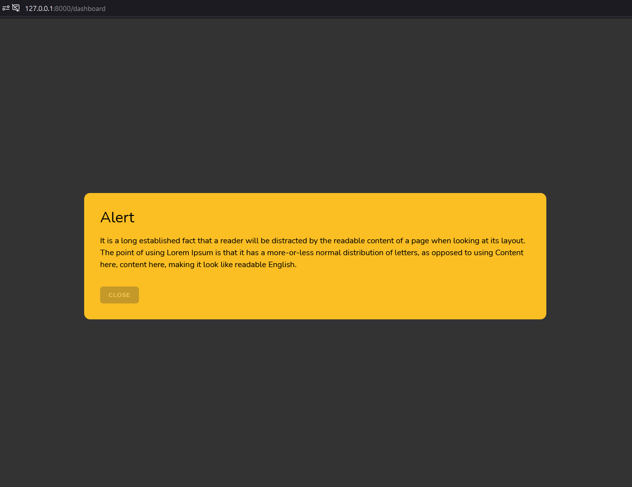
As you can see in the code above, we display the alert by flushing message data using session but in further step, I will show you how we can pass the message string, title, and color to display the alert.
STEP4: Enhanced Alert Component
- Change the class of alert component to have 3 parameters in the constructor (message, title, and type)
<?php

namespace App\View\Components;

use Illuminate\View\Component;

class Alert extends Component
{

    public $message;
    public $title;
    private $type;

    /**
     * Create a new component instance.
     *
     * @return void
     */
    public function __construct($message = null, $title = null, $type = null)
    {
        //
        $this->message = $message;
        $this->title = $title;
        $this->type = $type;
    }

    public function backgroundCSS(){
        return [
            'error' => 'bg-red-400',
            'success' => 'bg-green-400',
            'warning' => 'bg-yellow-400'
        ][$this->type];
    }

    /**
     * Get the view / contents that represent the component.
     *
     * @return \Illuminate\Contracts\View\View|\Closure|string
     */
    public function render()
    {
        return view('components.alert');
    }
}
- Modify blade view of the alert component to append accordingly when changing values of the parameters above
<div class="fixed inset-0 z-50 bg-black bg-opacity-80 flex items-center justify-center p-8">
    <div class="{{ $backgroundCSS() }} w-full md:w-1/2 rounded-xl p-8">
        <h3 class="text-3xl">{{ $title }}</h3>
        <div class="mt-4">
            {{ $message }}
        </div>
        <button class="mt-8 inline-flex items-center px-4 py-2 bg-gray-800 border border-transparent rounded-md
        font-semibold text-xs text-white uppercase tracking-widest hover:bg-gray-700 active:bg-gray-900
        focus:outline-none focus:border-gray-900 focus:ring ring-gray-300 disabled: opacity-25 transition ease-in-out duration-150">
        Close
        </button>
    </div>
</div>
- Using alert component with different options as below
<body>

        @if(session('alert_message'))
            <!--<x-alert :message="session('alert_message')" title="Error Title" type="error"></x-alert>-->
            <!--<x-alert :message="session('alert_message')" title="Success Title" type="success"></x-alert>-->
            <x-alert :message="session('alert_message')" title="Warning Title" type="warning"></x-alert>
        @endif

    </body>
STEP5: Alpine.js
- Include alpine.js from CDN to add an action listener to your close button just like Vue.js
<script src="https://cdn.jsdelivr.net/gh/alpinejs/alpine@v2.x.x/dist/alpine.js" defer></script>
- Adding data property "show" and event on-click on button close like code below
<div class="fixed inset-0 z-50 bg-black bg-opacity-80 flex items-center justify-center p-8"
x-data="{show: true}"
x-show="show">
    <div class="{{ $backgroundCSS() }} w-full md:w-1/2 rounded-xl p-8">
        <h3 class="text-3xl">{{ $title }}</h3>
        <div class="mt-4">
            {{ $message }}
        </div>
        <button class="mt-8 inline-flex items-center px-4 py-2 bg-gray-800 border border-transparent rounded-md
        font-semibold text-xs text-white uppercase tracking-widest hover:bg-gray-700 active:bg-gray-900
        focus:outline-none focus:border-gray-900 focus:ring ring-gray-300 disabled: opacity-25 transition ease-in-out duration-150"
        x-on:click="show=false">
        Close
        </button>
    </div>
</div>
That's it and now you will be able to use alert component anywhere inside your laravel project.
About author

SETHA THAY
Software Engineer & Project Manager. I am willing to share IT knowledge, technical experiences and investment to financial freedom. Feel free to ask and contact me.
You may also like